Guest-Blog: 7 Rooms That Pull off the Minimalist Look
By Jane Blanchard
Sometimes less is more when you're decorating. The minimalistic look uses clean lines and shapes to provide a functional and anything-but-cluttered environment. It always looks clean and organized, even if it's dangerous to open the coat closet. With a sophisticated air, the perfect minimalist room manages to look decorated and put together yet without too many extra things lying around.
If you think minimalistic rooms are just bare bones and empty, think again and take a look at these 7 beautiful examples of minimalist done right.
1. Keep it all functional
 via Houzz
This minimalist dining room stays interesting with its use of various textures. The wood paneling is unique look without adding anything to the wall. Using a chair as decor is a functional way to add something to fill empty space. If there's ever an unexpected guest, it can simply be pulled right up to the table.
2. Back to Basics
via Houzz
This minimalist dining room stays interesting with its use of various textures. The wood paneling is unique look without adding anything to the wall. Using a chair as decor is a functional way to add something to fill empty space. If there's ever an unexpected guest, it can simply be pulled right up to the table.
2. Back to Basics
 via Houzz
A bedroom simply put is a room with a bed. It's the place used for sleeping in. This room is simply a room with a bed, but it still looks like a piece of art. The right bed can make or break a minimalistic bedroom. What makes this work so well is the symmetry between the bed and the simple lighting, with the asymmetry in the bedding to change it up a little.
3. Keep away the clutter
via Houzz
A bedroom simply put is a room with a bed. It's the place used for sleeping in. This room is simply a room with a bed, but it still looks like a piece of art. The right bed can make or break a minimalistic bedroom. What makes this work so well is the symmetry between the bed and the simple lighting, with the asymmetry in the bedding to change it up a little.
3. Keep away the clutter
 via Houzz
Bathrooms are probably one of the easiest spaces to clutter, especially if it's shared by multiple people with multiple products. Things just pile up. This bathroom maximizes usable space with clean-cut cabinets to keep things off the super sleek countertops.
4. Decorating at the minimum
via Houzz
Bathrooms are probably one of the easiest spaces to clutter, especially if it's shared by multiple people with multiple products. Things just pile up. This bathroom maximizes usable space with clean-cut cabinets to keep things off the super sleek countertops.
4. Decorating at the minimum
 via Houzz
Even the artwork in this room is minimalistic, and we're in love with that painting. All the living room essentials are there: comfy seating, entertainment system, and great lighting. The decor is kept to just a few pieces such as the candles and the plant, which work beautifully.
5. Streamline your kitchen
via Houzz
Even the artwork in this room is minimalistic, and we're in love with that painting. All the living room essentials are there: comfy seating, entertainment system, and great lighting. The decor is kept to just a few pieces such as the candles and the plant, which work beautifully.
5. Streamline your kitchen
 via Houzz
Handleless cabinets are all the rage right now. They look clean and there's zero chance of bruising your hip from running into a handle. What really works in this kitchen is the lighting, though. With the exception of the three pieces above the island, the lights are beautiful yet completely unobtrusive.
6. Black and White
via Houzz
Handleless cabinets are all the rage right now. They look clean and there's zero chance of bruising your hip from running into a handle. What really works in this kitchen is the lighting, though. With the exception of the three pieces above the island, the lights are beautiful yet completely unobtrusive.
6. Black and White
 via Houzz
Monochrome is another staple of the minimalist trend. Nothing looks more clean and simple than black and white. To keep the look from being boring pieces of solids, try breaking it up with something like a cow skin rug or shiny stainless steel accent pieces.
7. Pop of Color
via Houzz
Monochrome is another staple of the minimalist trend. Nothing looks more clean and simple than black and white. To keep the look from being boring pieces of solids, try breaking it up with something like a cow skin rug or shiny stainless steel accent pieces.
7. Pop of Color
 via Houzz
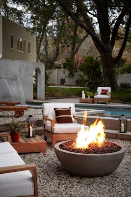
On the contrary, black and white doesn't fit into every home. Sometimes what you need is a pop of color to brighten it up. Again, using clean lines, it's relatively simple to add something like a square on a table which matches the warm minimalistic and mantel-less fireplace.
For more design inspiration and advice, go to Modernize.com.
via Houzz
On the contrary, black and white doesn't fit into every home. Sometimes what you need is a pop of color to brighten it up. Again, using clean lines, it's relatively simple to add something like a square on a table which matches the warm minimalistic and mantel-less fireplace.
For more design inspiration and advice, go to Modernize.com.


Kommentare
Kommentar veröffentlichen